Want to refresh your home with a new coat of paint? Tired of that color you’ve had for years? Some of the biggest names in paint like Sherwin-Williams, Benjamin Moore, and Behr have announced their picks for 2018’s color of the year. Whether you love neutrals, prefer moody hues, or want something bold, there’s sure to be a color on this list that speaks to you!
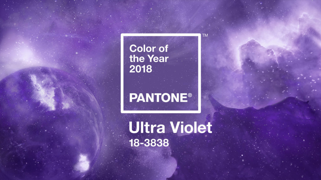
Pantone: Ultra Violet
Pantone never shies away from choosing daring hues for their color of the year. Last year’s choice was a bright green and this year they’ve gone with Ultra Violet, a vivid shade of purple. You can read more about their selection here.
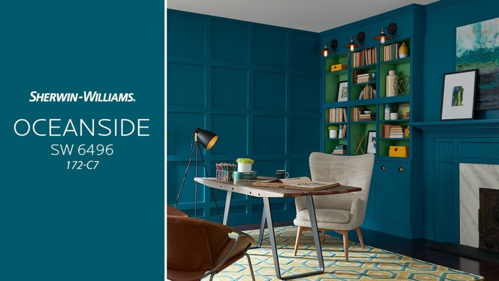
Sherwin-Williams: Oceanside
If purple isn’t for you, take a look at Sherwin-Williams’ choice for 2018, a jewel toned blue-green hue called Oceanside. This is a rich and robust color, but it’s also just subdued enough that it could be used as a neutral to balance other, brighter colors.
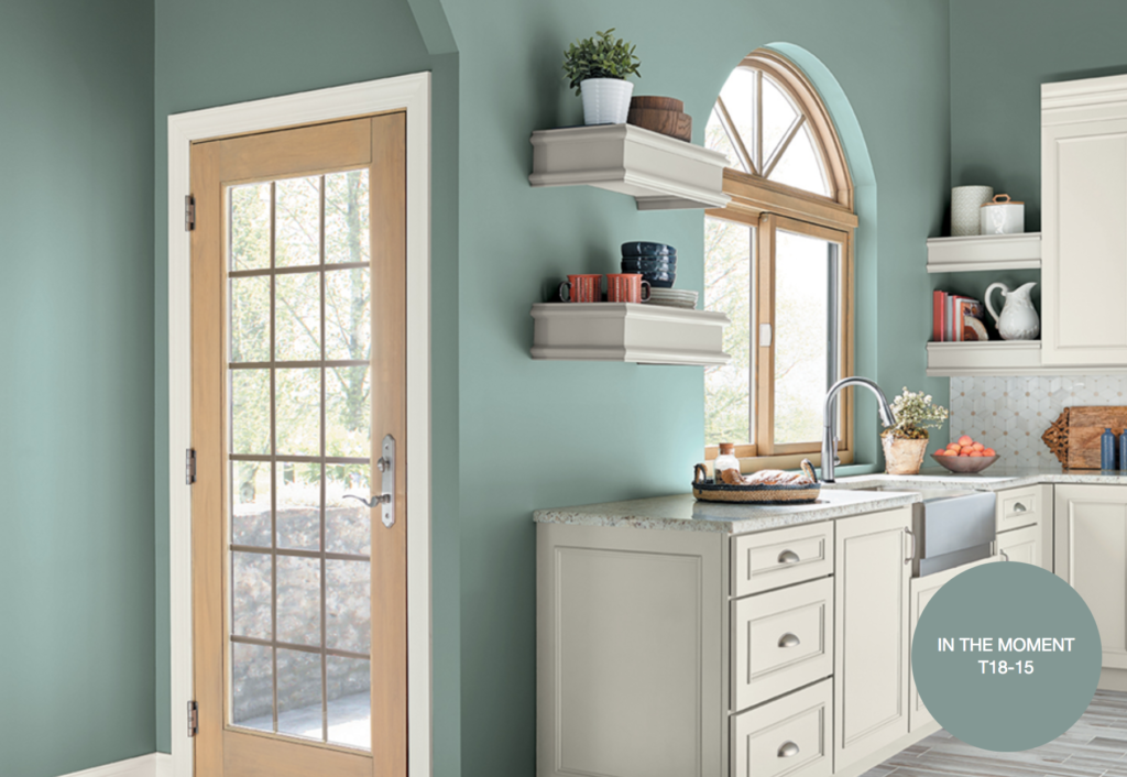
Behr: In the Moment
Behr’s choice for its Color of the Year, In the Moment, is a tranquil mix of blue, grey, and green. This would be a great choice for coastal spaces. In the Moment could work equally well on the walls or on your cabinetry.
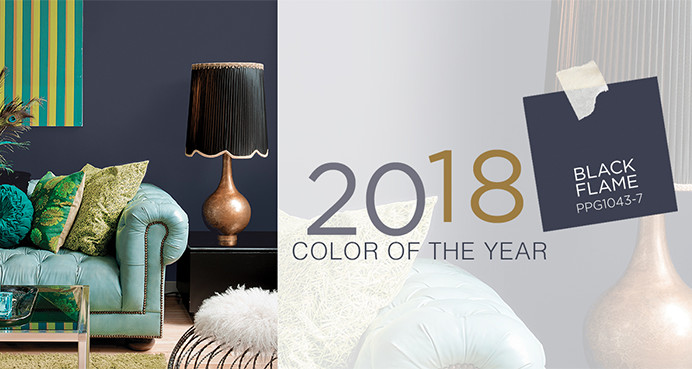
PPG Paints: Black Flame
If you’re tired of everything light and bright and want to select a moody color, PPG Paints had chosen Black Flame as their 2018 color of the year. Not a true black, this hue has tones of indigo and grey. This color will make a statement wherever it is used!
Benjamin Moore: Caliente
Definitely the spiciest color on this list, Benjamin Moore’s choice for 2018, Caliente, is a rich, brick red. This color would be great in the kitchen or on the front door. It could also be used to bring a pop of color into a neutral space. Click here to learn more about this vibrant shade.
Glidden Paint: Deep Onyx
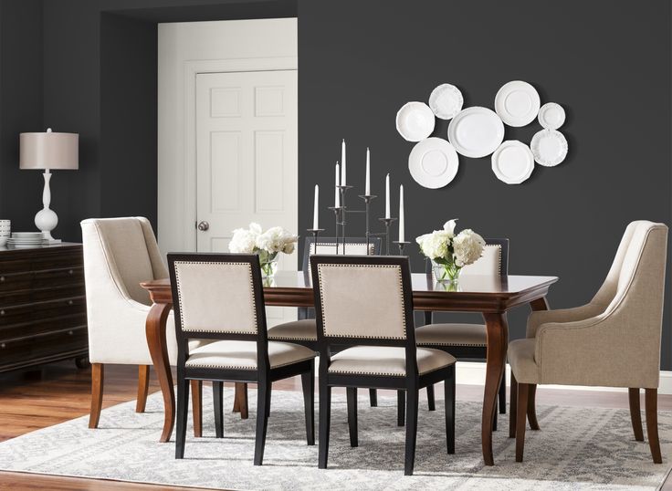
Perhaps unsurprisingly Glidden Paint (which is a PPG Paint brand) chose Deep Onyx as their color of the year. This shade is more of a true black than PPG’s Black Flame, but tones of grey keep Deep Onyx from being too harsh. Use it as a primary color or as an accent.
Dunn-Edwards: The Green Hour
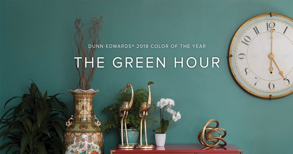
Dunn-Edwards’ The Green Hour, takes its name from turn-of-the-century Paris. 5 o’clock became known as “The Green Hour” due to the popularity of absinthe. This hue is a rich and muted shade of blue-green that will work well in all areas of the home.
Dutch Boy Paints: Sandstone Tint
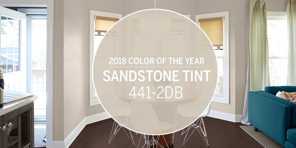
Grey and white have been the reigning neutrals for years. But Dutch Boy Paints’ choice of Sandstone Tint, a light sand color, could signal a return to beige and brown. Sandstone Tint is described as a color “perfectly balanced between warm and cool” making it a great neutral for any space.
Pratt & Lambert: Heron
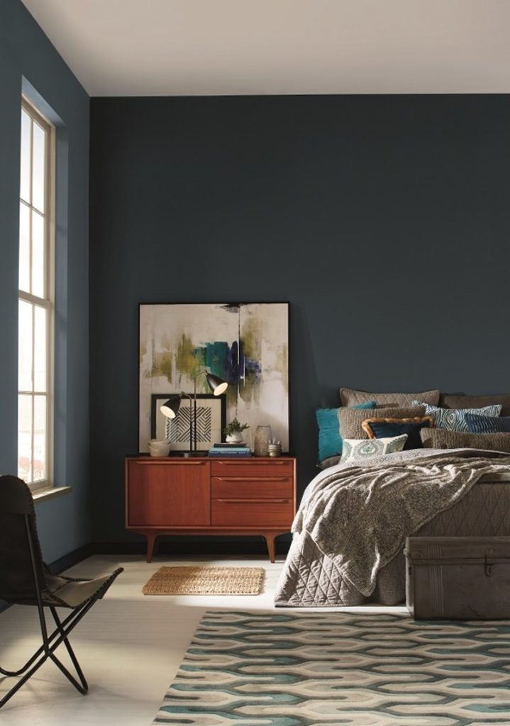
Pratt & Lambert chose Heron as their color of the year for 2018. Heron is a calming midnight blue. It’s an elegant color that inspires relaxation and would be great for a bedroom or living space.
If you’ve decided to take the plunge and repaint, I’d be happy to provide you with the names of a few local professionals in San Diego. If you’re updating your home in anticipation of putting it on the market, give me a call so we can discuss what improvements your home needs to appeal to the broadest range of buyers!
